In the world of sports, the competition starts long before the first throw. It starts on the notice board. A weak, cluttered flyer will get lost in the noise, but a powerful, dynamic design can fill the stands and pack your roster. Your event has energy and passion, and your flyer should too. This is because it’s your first impression and your most important recruitment tool. So, if you want to create a sports flyer that grabs attention and drives action, you need to follow some design conventions. Here are a few to get you started.
Stick to a color scheme
Your color choices can showcase your team identity and emotion. A consistent color scheme makes your flyer look professional and instantly recognizable, creating a stronger connection with fans. So, start with the official colors of the team, league, or school you are promoting.
Make sure you limit your palette to two or three complementary colors to avoid a chaotic look. Use your boldest, most vibrant color for key information like the event title or date. This way, the information will stand out. Most importantly, always ensure there is high contrast between your text and the background to guarantee your flyer is easy to read, even from a distance.
Mention the key details
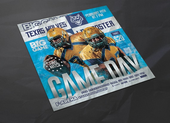
A flyer’s primary job is to inform. Even the most dynamic design fails if the essential details are unclear or missing. Your flyer must quickly answer these key questions: Who is playing? What is the event ? When is it? and Where is it?
You should use a strong visual hierarchy to showcase these details. The event title and team names should be the largest. Then, the date and time should be prominent and impossible to miss. After that, group related details together and always use a clean, legible font for this information. You should use an AI Writer to generate this text, so that you can incorporate these specifications without worrying about your own writing.
Use dynamic typography
Your flyer’s typography should shout energy and excitement. Choose fonts that are bold, impactful, and full of motion to mirror the action of the sport itself. So, opt for strong, easy-to-read sans-serif or slab serif fonts. Think thick, blocky letters that convey power and are easy to read from a distance.
It is also a great strategy to stick to a maximum of two complementary fonts: one for the main, attention-grabbing headline and a simpler, clean font for the key details to ensure legibility. Make sure you vary the size and weight of your text to create a clear visual hierarchy, guiding the reader’s eye from the most important info downwards.
Add action shots
Ditch the static team photos and use a powerful, high-resolution action shot. This will instantly inject energy into your flyer. In addition, it will capture the raw excitement of the game before it even begins. Think of a volleyball player captured mid-spike, a football player scoring a touchdown, or a baseball player sliding into a base.
This single image should be the hero of your design, often serving as a dynamic background for your text. A great action shot doesn’t just show the sport; it sells the adrenaline and drama, making your game feel absolutely unmissable.
Make your layout attractive
An attractive layout is all about creating energy and guiding the viewer’s eye. Start by establishing a strong visual hierarchy. So, make your event title and team logos the biggest and boldest elements so they’re seen first. Don’t be afraid of negative space, as it’s crucial for preventing a cluttered look and making your key details pop.
Then, add a dynamic feel to make it perfect for sports. To do this, use diagonal lines and angled text to create a sense of motion and excitement. A well-planned layout ensures your information is easy to digest while making your flyer stand out on any notice board. Therefore, you should make the best layout possible using the free sports flyer templates on PosterMyWall.
Balance the text and images
Achieving the right balance means your text and image must work as a team. Let your action shot be the star player that grabs all the attention, while your text provides the essential, game-winning stats. In addition, a popular and effective technique is to overlay your text directly onto the background image.
Make sure your flyer is readable. So, place text over a less busy part of the photo, like the sky or an open field. For maximum impact, use a semi-transparent color overlay or a dark gradient behind the text. This makes your words pop without sacrificing the image’s power, creating a unified look.
In the end, a great sports flyer is more than just paper and ink. Instead, it’s the promise of an epic event. It’s a ticket to the action before the tickets are even sold. If you focus on a clean layout, powerful action shots, and essential details, you create a direct line from the notice board to the stands. You’re not just inviting people, you’re building hype from the ground up. Use these tips to craft a flyer that’s as professional and exciting as the game you’re promoting.


